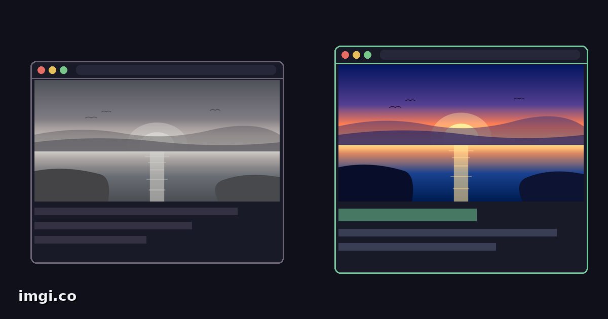
Every agency portfolio says transformed. The case studies that make prospects stop scrolling are the ones that prove it, and for a website redesign there’s exactly one honest proof: the old site and the new site, same page, same width, with a handle the visitor drags to flip between them. It turns your redesign from a claim into an experience, and it takes maybe fifteen minutes of capture work. If you do it in time. That part trips up everyone.
Capture the old site before it stops existing
The day the redesign ships, the old site is gone, and with it your before. Archive crawlers keep copies of many pages, but a crawler’s snapshot renders with missing fonts, blocked scripts, and broken layouts often enough that betting your case study on one is a gamble. The screenshots you take yourself, today, in a real browser, are the only before you fully control.
So the first rule of redesign comparisons is calendar-shaped: capture the outgoing site during the project, not after. Every key page, desktop and mobile widths, while it still works.
Plenty of agencies learn this one the expensive way: a launch celebrated, a case study planned, and no usable capture of the thing that got replaced. The new site looked great next to nothing.
Matched captures, the part that decides everything
A before and after slider only reads as fair when the two frames align, and web pages fight you on this more than game screenshots do. The checklist:
- Match the viewport width exactly. A site captured at 1440 against one captured at 1366 shows reflowed layouts, and the slider turns that into visual noise. Pick standard widths, desktop and one mobile, and use them for both captures.
- Shoot the same page in the same state, homepage against homepage, pricing against pricing. Close cookie banners, dismiss popups, let webfonts finish loading, and freeze any hero carousel or animation before shooting. A half-loaded before flatters the after dishonestly.
- Full-page screenshots via your browser’s own capture tool (the developer tools in most browsers do this cleanly) rather than stitching viewport shots by hand.
- PNG, since UI is text and hard edges, the exact things lossy formats chew. The format guide explains why this matters more for interfaces than for photos.
The long-page problem
Here’s the wrinkle unique to websites: pages scroll, and two full-page captures are almost never the same height. The old homepage ran 4,100 pixels tall, the new one runs 6,300, and a slider needs both sides in the same frame to mean anything.
Don’t compare entire pages. Compare sections. Hero against hero, pricing table against pricing table, footer against footer, each pair cropped to the same dimensions. Section pairs are more persuasive anyway, because a prospect looking at your case study thinks in sections too: this is what they did to the navigation, this is what happened to the product grid.
One imgi comparison holds up to ten images with a dropdown to swap pairs, so a whole redesign fits in a single link: old hero, new hero, old pricing, new pricing, and so on. For bigger projects, one comparison per page grouped into an album keeps a multi-page redesign under one URL.
Presenting it: case study, pitch, and social
On your own site, embed the slider straight into the case study with one line of HTML. Visitors drag it, and dragging does something a static image never will: it makes the prospect participate in the reveal. Label the sides with dates or version names rather than before and after, since a 2023 to 2026 jump carries its own argument.
In a pitch, the same link works as a live prop. Sending a proposal to a client whose site you want to redesign? Capture their current homepage, mock the direction, and send a slider of the two. It’s more convincing than a static mockup deck for the same reason the case study works, and it costs you one upload. Keep it private if the pitch is confidential; that’s what the private option exists for.
For social posts and portfolio sites that strip embeds, export the comparison as a GIF or MP4 and let the transition play on its own. The interactive link goes in the caption for whoever wants to inspect.
What the slider can’t say
A redesign comparison shows visual change, and visual change is not the same as improvement. A prettier page that converts worse is still a loss. So pair the slider with one or two outcome numbers when you have them, load time, conversion lift, bounce rate, and let the visual carry the feel while the numbers carry the claim. When you don’t have numbers yet, say the redesign is fresh rather than implying results. Prospects notice restraint, and the ones worth having notice it most.
Also worth saying plainly: a slider between two designs invites pixel-level scrutiny of both. If the old site had solid bones, the comparison will show that too. Present the pairs where your work stands the inspection, which, if the redesign earned its fee, is most of them.