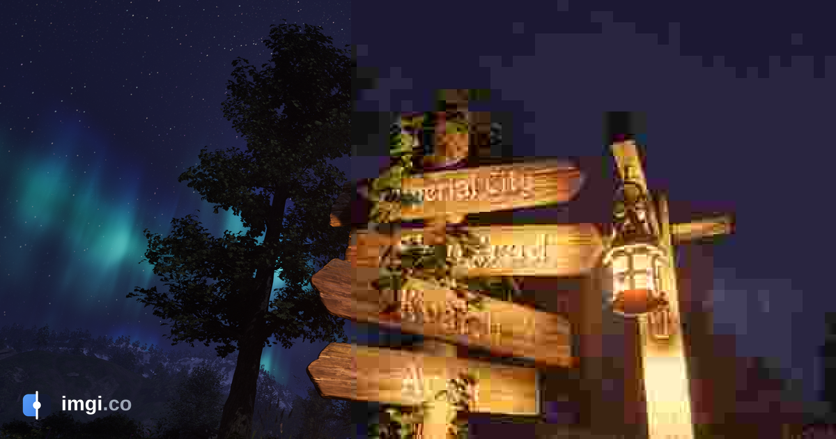
A 2560x1440 game screenshot saved as PNG weighs 5.0 MB. The same image saved as a JPEG at quality 75 weighs 396 KB, and from arm’s length you can’t tell them apart. Push the slider down to quality 7 and you get a 71 KB file that looks like it was printed on wet newspaper. Those numbers come from a real file, measured for this post, and the whole story of JPEG lives in the gap between them: what the format throws away, why you usually don’t notice, and why, when you do notice, the damage has such a specific and recognizable look.
This is a long explainer. If you just want to know which format to pick for a screenshot, that guide already exists. This post is about what happens inside the encoder, because once you understand the machine, every JPEG artifact you’ve ever squinted at stops being random noise and becomes a legible fingerprint. Blocking, ringing, mosquito noise, smeared reds: each one traces back to a single design decision made decades ago.
Older than you think
The math at the heart of JPEG predates the format by nearly twenty years. In January 1974, Nasir Ahmed, T. Natarajan and K. R. Rao published a four-page paper in IEEE Transactions on Computers describing the discrete cosine transform. Ahmed had proposed the idea to the National Science Foundation in 1972 and, in a detail that says a lot about how research funding works, the NSF declined to fund it. He worked on it anyway.
The Joint Photographic Experts Group, the committee the format is named after, spent the late 1980s turning transform coding into a standard that fax machines, printers and this new thing called a personal computer could all agree on. The result was published in 1992 as ITU-T Recommendation T.81, also known as ISO/IEC 10918. That document is still the law of the land. Every JPEG your phone produces today is, at the container level, a file a 1992 decoder could read.
Thirty-plus years is an absurd lifespan for a piece of technology. The reason JPEG survived WebP, HEIC, AVIF and every other challenger is not that it’s better. It’s that it made one clever bet, and the bet still pays: human eyes are bad at exactly the things that cost the most bits to store.
Loss number one happens before “quality” does anything
Open an image editor, hit export, and you get a quality slider. Most people assume that slider is the lossy part. It’s the second lossy part.
The first thing a JPEG encoder does is convert your image from RGB to a color space called YCbCr: one channel for brightness (luma, the Y) and two for color (chroma, Cb and Cr). This conversion exists because your retina isn’t a uniform sensor. It resolves fine detail in brightness far better than fine detail in color, so the encoder can afford to be ruthless with the color channels while treating brightness with respect.
Ruthless means this: in the most common configuration, called 4:2:0 chroma subsampling, the encoder keeps one color sample for every 2x2 block of pixels. The color resolution of your image is cut in half in both directions before any quality setting is consulted. A 2560x1440 image carries its color information at 1280x720.
For photos, this is close to free. For a screenshot with red text on a dark background, it’s a massacre, because a sharp color edge that lands inside one of those 2x2 blocks gets averaged into mush. That’s why small colored text in a JPEG grows a dirty halo even at quality 95. The quality slider never touched it. The subsampling did.
You can measure the cost directly. That same 1440p screenshot saved at quality 90 with 4:2:0 subsampling comes out at 730 KB. Saved at quality 90 with full-resolution color (4:4:4), it’s 924 KB. The encoder is buying a 21 percent discount with your color detail, and most export dialogs never mention it.
The 8x8 grid
Next, the encoder slices each channel into tiles of 8 by 8 pixels and processes every tile independently. Each one goes through the DCT, which re-describes those 64 pixel values as a weighted mix of 64 fixed frequency patterns: one flat base tone (the DC coefficient, effectively the tile’s average), plus 63 patterns of increasingly fine stripes and checkers (the AC coefficients).
Nothing is lost in this step. It’s a change of language, the same tile, described differently. But the new language has a wonderful property: for natural images, most of the energy piles up in the first few coefficients. A patch of sky is almost entirely its average value plus a whisper of gradient. A patch of skin, same. The 40 or 50 highest-frequency coefficients in a typical photographic tile are nearly zero.
Why 8x8? Because 1980s hardware could hold an 8x8 tile in memory and process it quickly, and because it’s a reasonable middle ground: big enough that frequency analysis means something, small enough that one tile rarely spans wildly different content. Modern codecs like HEVC and AV1 use variable block sizes up to 64x64 and larger for exactly this reason, but JPEG is frozen at 8x8, and that frozen grid is about to become visible.
Quantization, where the actual loss lives
This is the step the quality slider controls, and the only place in the whole pipeline where image data is deliberately destroyed.
Each of the 64 DCT coefficients gets divided by a number from a 64-entry quantization table, and the result is rounded to the nearest integer. Rounding is the loss. A coefficient of 43 divided by a table entry of 40 becomes 1, and reconstructs as 40. The 3 is gone forever. A small coefficient divided by a large table entry rounds to zero and vanishes entirely.
The table is where human vision gets encoded as policy. The T.81 spec’s Annex K includes example tables, derived from psychovisual experiments, in which the divisor for the lowest-frequency luma coefficient is 16 and the divisor for the highest-frequency one is 99. Fine detail is punished roughly six times harder than broad strokes, because you were never going to miss it anyway. The chroma table is harsher still.
The quality number you pick just scales these tables. In libjpeg’s implementation, which most software inherited, quality 50 uses the Annex K tables as-is; higher settings shrink the divisors, lower settings inflate them. Below 50, the scaling turns aggressive fast: at quality 10, divisors are five times the baseline, and at that point most AC coefficients in most tiles round to zero. Each tile degenerates toward a flat square of its own average color, which is the mosaic look every low-quality JPEG shares.
Two things follow from this that trip people up constantly. First, quality is not a percentage of anything. Quality 90 doesn’t preserve “90 percent” of the image, and quality values aren’t comparable across encoders, since different software ships different base tables and different scaling curves. Second, there’s no way back. Decoding a JPEG multiplies the rounded coefficients by the table again, but the rounded-off remainders are not in the file. Sharpening filters and AI enhancers can invent plausible replacements, but nothing can retrieve the real values, because they aren’t anywhere.
After quantization, the encoder reads the 64 coefficients in a zigzag order that sorts them roughly from coarse to fine, run-length encodes the long tail of zeros, and Huffman-codes the result. Those last stages are lossless bookkeeping, the vacuum-packing around the actual amputation.
A field guide to the damage
Everything JPEG does wrong follows from the three decisions above: subsample the color, tile the image, round the frequencies. That gives the artifacts a taxonomy you can learn like birdwatching.
Blocking. Every tile is compressed alone, with no knowledge of its neighbors. At high quality their edges agree closely enough that the seams are invisible. Crush the quality, and adjacent tiles of what should be a smooth gradient round to visibly different averages, snapping the 8x8 grid into view. Skies, shadows and out-of-focus backgrounds show it first, because smooth regions have nowhere to hide a seam.
Ringing. A sharp edge, in frequency language, needs all 64 patterns cooperating with precise weights. Quantization perturbs the weights and deletes the finest ones, and the cooperation falls apart: the edge reconstructs with ripples echoing alongside it, like the rings around a stone dropped in water. Signal processing people know it as the Gibbs phenomenon; in a screenshot it reads as ghostly outlines around text and logos.
Mosquito noise. Same cause as ringing, less coherent result. Around busy edges the deleted coefficients differ from tile to tile, so the ripple pattern shifts, and in video or animated content it shimmers frame to frame like a cloud of insects around the edge. Still images show it as grainy speckle hugging high-contrast boundaries.
Color smear. The subsampling tax. Saturated edges, red especially, bleed past their borders because the color channel literally has half the resolution of the brightness channel. This is the artifact quality can’t fix, short of an encoder that offers 4:4:4.
Here’s what all of them look like at once. The comparison below is that same 1440p screenshot, original PNG on one side, quality 7 JPEG on the other. Drag the handle over the sky for blocking, the signpost text for ringing, the lit windows for color smear:
Seventy-one kilobytes. It’s almost impressive how much of the scene survives, until you look anywhere specific.
Quality 100 is not lossless
A persistent belief, and a reasonable-sounding one: crank the slider to 100 and the JPEG is perfect. It isn’t, for two reasons that should now be easy to see.
The first is that subsampling usually survives the slider. Plenty of export paths keep 4:2:0 chroma at every quality setting, so your color channels are living at half resolution no matter what the number says. Some encoders switch to full-resolution color at high quality settings and some let you choose, but “100” by itself promises nothing.
The second is arithmetic. At quality 100 the divisors shrink to 1, which sounds like no quantization at all, but the DCT itself is computed in real numbers and the coefficients still get rounded to integers, the pixel values get rounded again on the way back, and both channels took a trip through the YCbCr conversion with its own rounding. Each of these is a tiny error. None of them is zero. Save a busy image at quality 100 and diff it against the source and you’ll find thousands of pixels off by a step or two.
The test image makes it concrete. Saved at quality 100 with full-resolution color, 3.0 million of its 3.7 million pixels come back changed, every one of them within 4 steps of the original. Invisible, yes. Identical, no. And the file weighs 4.2 MB, nearly six times the quality 90 version and most of the way back to the 5.0 MB lossless PNG. The practical rule: quality 100 is a very good copy at a terrible price, and it is still not an archive. Archives are PNG.
Progressive JPEGs, and why some images load blurry-then-sharp
You’ve seen two kinds of JPEG load on a slow connection. One fills in from the top like a window shade. The other appears instantly as a blurry whole and sharpens in waves. Both behaviors are in the T.81 spec.
Baseline JPEGs store each 8x8 tile completely, one after another, top-left to bottom-right, so a partial file is a complete top half and a missing bottom half. Progressive JPEGs reorder the same data by importance instead of position: the first scan carries every tile’s DC coefficient (the flat average, effectively a 1/64th-scale thumbnail), and later scans layer in bands of AC coefficients, coarse stripes first, fine texture last. A quarter of a progressive file is a soft but complete picture.
The clever part is that this reordering is free. Same coefficients, same quantization, different sequence on disk; progressive files even come out slightly smaller on average, because grouping similar coefficients together gives the entropy coder friendlier statistics. Most large sites serve progressive JPEGs for exactly this reason. It’s one of the few places in this story where you get something for nothing.
The edits that don’t cost a generation
One more trick hiding in the coefficient structure: some edits can skip the decode-edit-reencode cycle entirely and shuffle the quantized coefficients directly, which means zero added loss.
Rotating by 90, 180 or 270 degrees, mirroring, and cropping all qualify, with one catch. Tools like jpegtran, which ships with libjpeg-turbo, perform these as pure coefficient rearrangements. The catch is the grid: a lossless crop can only cut on 8-pixel boundaries (16 in the subsampled color dimensions), because tiles can’t be split without recomputing them. Ask for a crop 3 pixels into a tile and the tool either snaps to the grid or quietly re-encodes the edge.
It’s a niche capability, but it underlines what a JPEG really is: not a grid of pixels, a grid of frequency recipes. Work within that structure and edits are free. Touch the pixels and you trigger a fresh round of quantization, which is the subject of the next experiment.
The recompression myth, tested
Everyone has heard that re-saving a JPEG destroys it a little more each time, the way a photocopy of a photocopy decays. It’s one of those claims that’s repeated more often than it’s tested, so we tested it for this post.
Take the screenshot, save it at quality 75, open the result, save it again at quality 75, and repeat fifty times. The surprise: almost nothing happens. Generation 1 lands at 35.6 dB PSNR against the original, and generation 50 sits at 35.5, essentially unchanged. Once the coefficients have been rounded onto the quality-75 grid, re-rounding them onto the same grid is close to a no-op. Saving an unmodified JPEG at the same settings is nearly idempotent, and the photocopier metaphor mostly fails.
Mostly. Now change one thing: between saves, crop a single column of pixels off the left edge. That shifts the whole image relative to the 8x8 grid, so every tile now covers different content, the DCT produces fresh coefficients, and the rounding does fresh damage. Same fifty saves, and the image falls off a cliff: 35.6 dB at generation 1, 31.3 dB by generation 10, 28.3 dB by generation 30, with colors drifting and edges growing fur.
That’s the version of the myth that survives testing. Re-saving isn’t the killer; re-saving after any change is. Crop, rotate, resize, meme-caption, screenshot-of-a-screenshot: each one realigns the grid and reopens every wound. It’s why an image that has bounced across group chats and social platforms for a week looks deep-fried even though no single step did much harm. Every platform in the chain re-encoded a slightly different image. If a picture will be edited again, it should travel as PNG until its final export, and this is also a good argument for keeping originals somewhere platforms can’t touch them.
What JPEG is still the right answer for
After several thousand words of autopsy it would be easy to conclude JPEG is bad. The opposite is true. For photographic content headed for a screen, JPEG at quality 80 to 90 remains an excellent default: at those settings the quantization mostly deletes information your eye discards anyway, and the files are a tenth the size of lossless. The measured ladder for our test image runs 1.11 MB at quality 95, 730 KB at 90, 396 KB at 75, then 244 KB, 145 KB and 82 KB at 50, 25 and 10. The knee of that curve, where savings stay large and damage stays invisible, sits right around 75 to 85 for most photos.
Where it’s the wrong answer is anything with hard synthetic edges: UI screenshots, text, line art, charts, pixel art. Those images are all high-frequency coefficients, precisely the ones the tables execute first, and they belong in PNG or lossless WebP. The same logic applies in the other direction when someone hands you a “lossless” claim: a benchmark screenshot or mod showcase that passed through JPEG somewhere in its life carries the grid in its shadows and the ripples around its edges, whatever the filename says.
There’s one more case worth calling out, because it’s the one this site exists for. If you’re comparing two images to judge a fine difference, a texture pack against vanilla, an AI upscale against its source, an export against the master, then compression artifacts in your comparison are contamination in the experiment. A side-by-side of two JPEGs at unknown quality settings measures the encoders as much as the subject. imgi serves comparisons with the exact bytes you upload, no re-encoding, precisely so the only differences on screen are the ones you’re trying to show. Slide a clean original against a suspect export and every block seam and mosquito swarm announces itself in half a second, which is quicker than any histogram.
Every JPEG carries its biography
A side effect of the design, and a gift to anyone doing image forensics: JPEGs testify about their own past.
The quantization tables travel inside the file. Since encoders ship different tables and scale them differently, the tables act as a fingerprint: tools can match them against known software to estimate what quality setting produced a file and sometimes what program saved it, regardless of what the metadata claims. A “straight from the camera” photo whose tables match a photo editor’s quality 60 preset has been talking to an editor.
The block grid leaves tracks as well. Compress once and the 8x8 block boundaries align to image coordinates that are multiples of 8. Paste in a patch from another JPEG, or crop and re-save without snapping to the grid, and the pasted region’s old block boundaries sit misaligned against the new ones, a periodic pattern that analysis tools pick out of the noise even when eyes can’t. Techniques like error level analysis lean on a related idea: re-save the image at a known quality and see which regions change more than they should, because regions with a different compression history respond differently to fresh compression.
None of this makes JPEG forensics magic (the internet’s re-encode carousel washes evidence out fast, and a screenshot of an image resets everything), but the principle is worth keeping: lossy compression isn’t just loss, it’s structured loss, and structure is legible. The same tools that told you why the sky went blocky can tell you where an image has been.
The heirs, briefly
Every modern image format is a commentary on JPEG’s weaknesses, and knowing the pipeline above, you can read the improvements like patch notes.
WebP’s lossy mode (borrowed from the VP8 video codec) and AVIF (from AV1) still transform blocks and quantize coefficients; the lossy core survives. What changed is everything around it. Blocks come in flexible sizes, so a flat sky can be one big cheap block while a face gets small careful ones. Blocks predict their content from already-decoded neighbors before transforming only the leftover error, which is where most of the compression gains live. And both formats run a deblocking filter at decode time that smooths tile seams away, which is why a heavily compressed AVIF degrades into soft plastic-looking smears rather than JPEG’s hard mosaic grid. Different failure look, same underlying bargain.
On the encoder side, JPEG itself got one last wind: Mozilla’s mozjpeg project squeezes meaningfully smaller files out of the 1992 format with smarter coefficient decisions, and it’s part of why the web’s JPEGs quietly improved in the 2010s without anyone changing file extensions.
Adoption tells the rest of that story. AVIF and WebP win benchmarks; JPEG still wins cameras, chat apps and three decades of installed decoders. Formats with network effects die slowly, and a format that every device since the Clinton administration can open has the strongest network effect in computing.
The shape of the trade
The DCT paper was four pages. The insight it planted, that images should be stored in the language of frequencies and that the boring frequencies deserve most of the bits, now sits inside every JPEG, every video call, every streamed movie and every phone camera on earth. HEVC quantizes transform coefficients. AV1 quantizes transform coefficients. The blocks got bigger and smarter, the entropy coding got exotic, but the amputation at the center is the one Ahmed proposed in 1972 and couldn’t get funded.
So the next time a JPEG looks off, read it like an X-ray. Grid in the sky: quantization ran out of gradient. Ripples around the letters: the high frequencies died. Red bleeding into the background: subsampling took its half. The file did nothing random. It made the same bet it’s made since 1992, that you wouldn’t be looking closely.
Put it under a slider, and look closely.