
Search for an image slider for websites and you will find two different things wearing the same name. One is a slideshow that rotates through a set of photos. The other, the one this guide is about, is a before and after slider: a single frame with a handle you drag left and right to reveal two versions of the same image. It is what you want when the whole point is the difference between before and after, like an edit, a redesign, an AI upscale, or a room makeover.
You can build one from scratch with a JavaScript library, or you can make it in your browser in under a minute and paste one line into your site. This guide covers the fast way, using imgi, a free tool with no signup.
A free image slider for websites
imgi turns two images into a draggable before and after slider you can share as a link or embed anywhere. Here’s one running live. Grab the handle and drag it:
No JavaScript, no CSS, no build step. You make the comparison once, copy a single line of HTML, and drop it into your page. It works anywhere you can add an embed or a raw HTML block: WordPress, Squarespace, Ghost, Webflow, Framer, or a hand-coded site.
How to embed an image slider, step by step
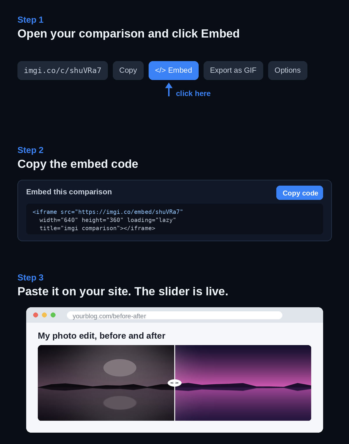
1. Make the comparison. Open the imgi home page, drag in your two images, a before and an after, and check that they line up. Add labels if you want to mark each side. Click Publish and you get a permanent link plus an embed for that exact comparison.
2. Copy the embed code. Open the Embed panel and copy the line it hands you. It is a plain iframe:
<iframe src="https://imgi.co/embed/YOUR_ID" width="640" height="360" style="border:0;border-radius:12px;background:transparent" loading="lazy" title="imgi comparison"></iframe>
3. Paste it where you want the slider. In WordPress, add a Custom HTML block and paste. In Squarespace, use a Code block. Ghost, Webflow, and Framer each have an embed or HTML element for the same job. Save the page and the slider is live, draggable on both desktop and touch.
Make it fit your layout
The width and height in the iframe set the size. Swap width=“640” for width=“100%” and the slider stretches to fill whatever column it sits in, which is usually what you want on a responsive site. Keep the height close to your images’ aspect ratio so nothing gets letterboxed. The iframe loads lazily, so it will not slow down the rest of your page.
Why people use imgi for this
A few reasons it tends to beat rolling your own:
- Nothing to install and no account to make.
- One link and one embed per comparison, and the link does not expire.
- Up to 10 images in a single slider, not just two.
- A GIF or MP4 export of the same comparison for places that strip iframes, like Reddit or a GitHub README.
Make the comparison, copy the line, paste it in. That’s the whole job.